Featured Work
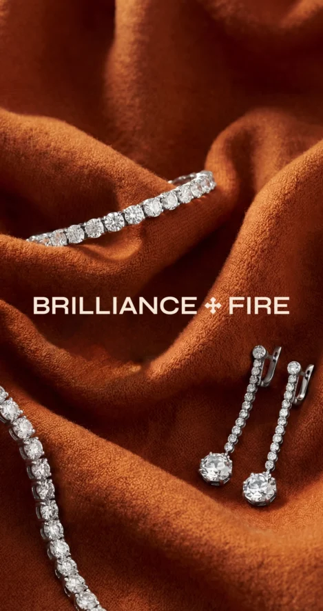
Brilliance+Fire: Repositioning a vintage brand for global growth
Jewellery specialists Brilliance+Fire sell antique, vintage and remastered pieces. Their jewellery is unique, but they were struggling to communicate the bespoke nature of their work through their visual brand. They needed to reposition their business if they were going to be able to unlock growing international markets.
Quality, craft, authenticity
Antique jewellery connects us to the past through stories and designs. We wanted our creative to reflect this emotional connection, tapping into themes of heritage and authenticity, and repositioning Brilliance+Fire as an aspirational, market-leading brand.
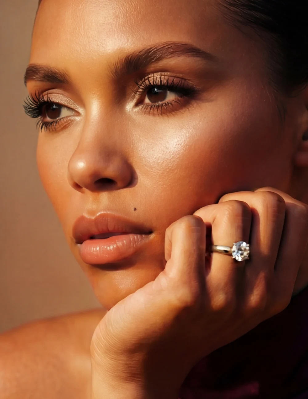
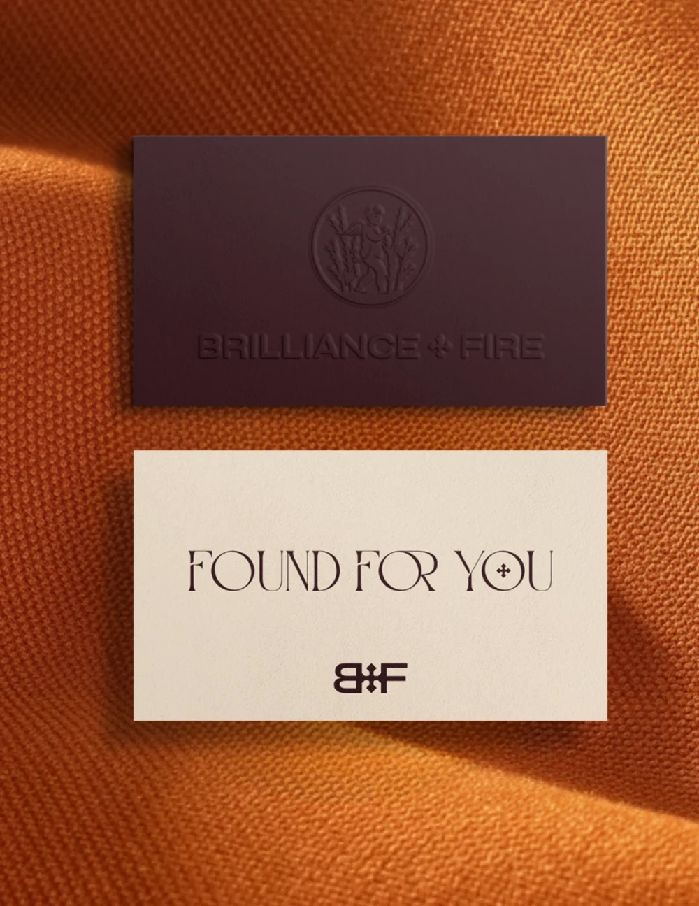
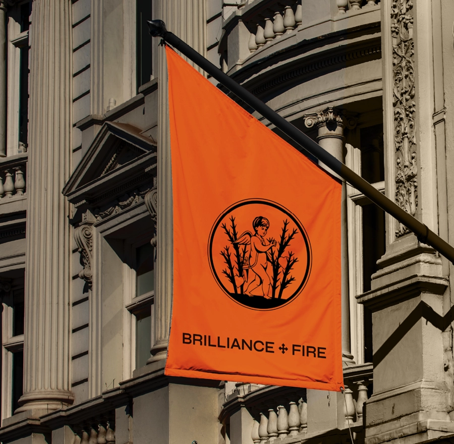
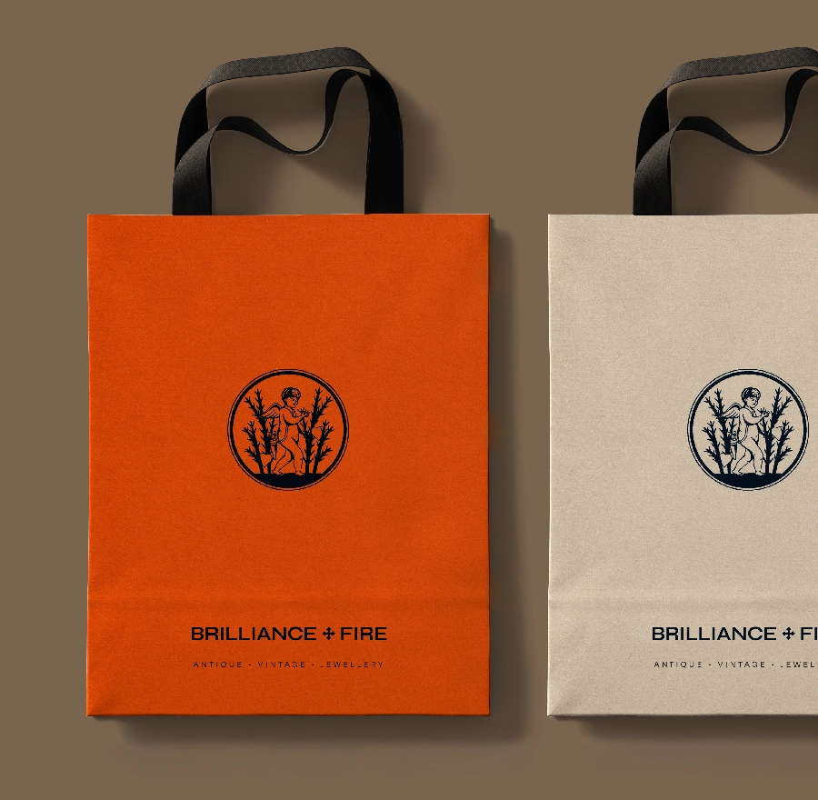
The cross, a core part of the Brilliance+Fire logo, is inspired by ancient church windows. The ‘B+F’ monogram, with its backwards looking ‘B’ and forwards looking ‘F’, represents both past and future. Bespoke AI photography provides a suite of unique images the client can develop as the brand grows.
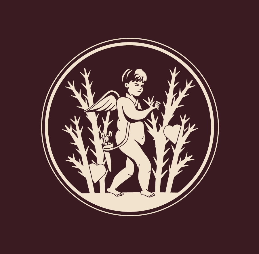
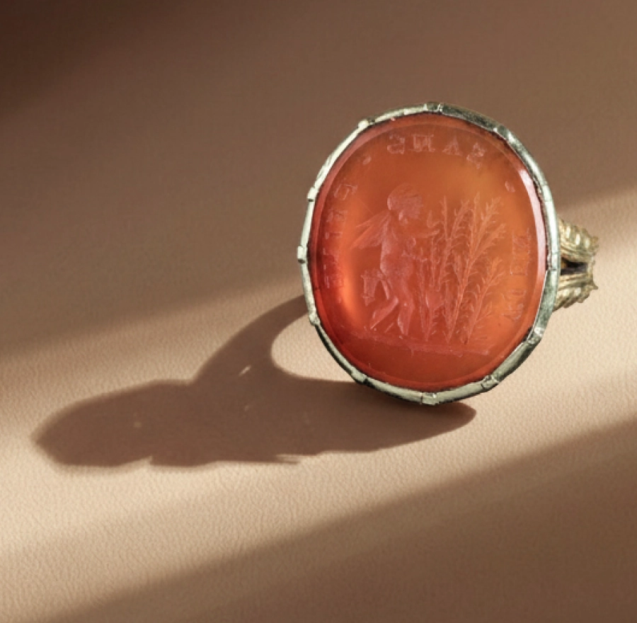
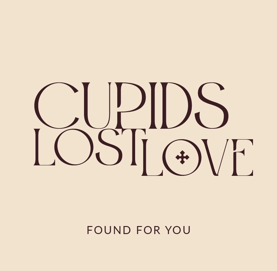
Cupid’s lost love
Inspired by our client’s own antique ring, the Cupid motif symbolises the enduring romance of vintage jewellery. Guided by the mantra, ‘Rien sans peine,’ (nothing without hardship), Cupid searches for love among the thorns in the same way Brilliance+Fire hunts down unique, beautiful antique pieces.
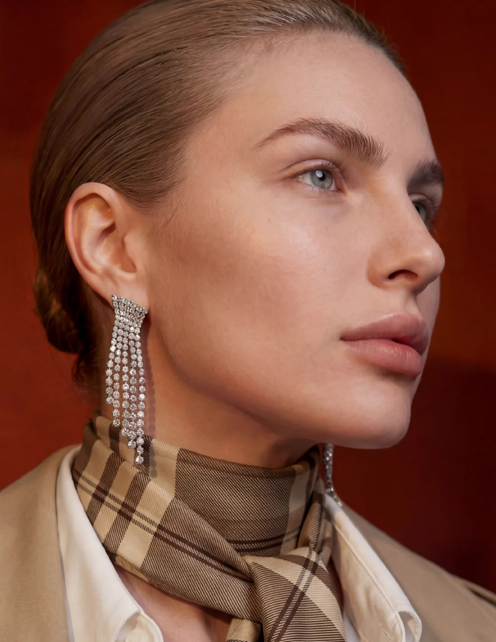
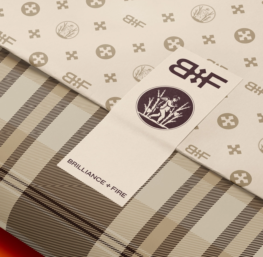

Our bespoke tartan texture adds another layer of brand heritage to create a multi-channel client experience which is authentic, reassuring and compelling.


Wildsmith Skin: Digital intelligence delivers luxury skincare experience
The best products are the ones that feel effortless.